01
.jpg)
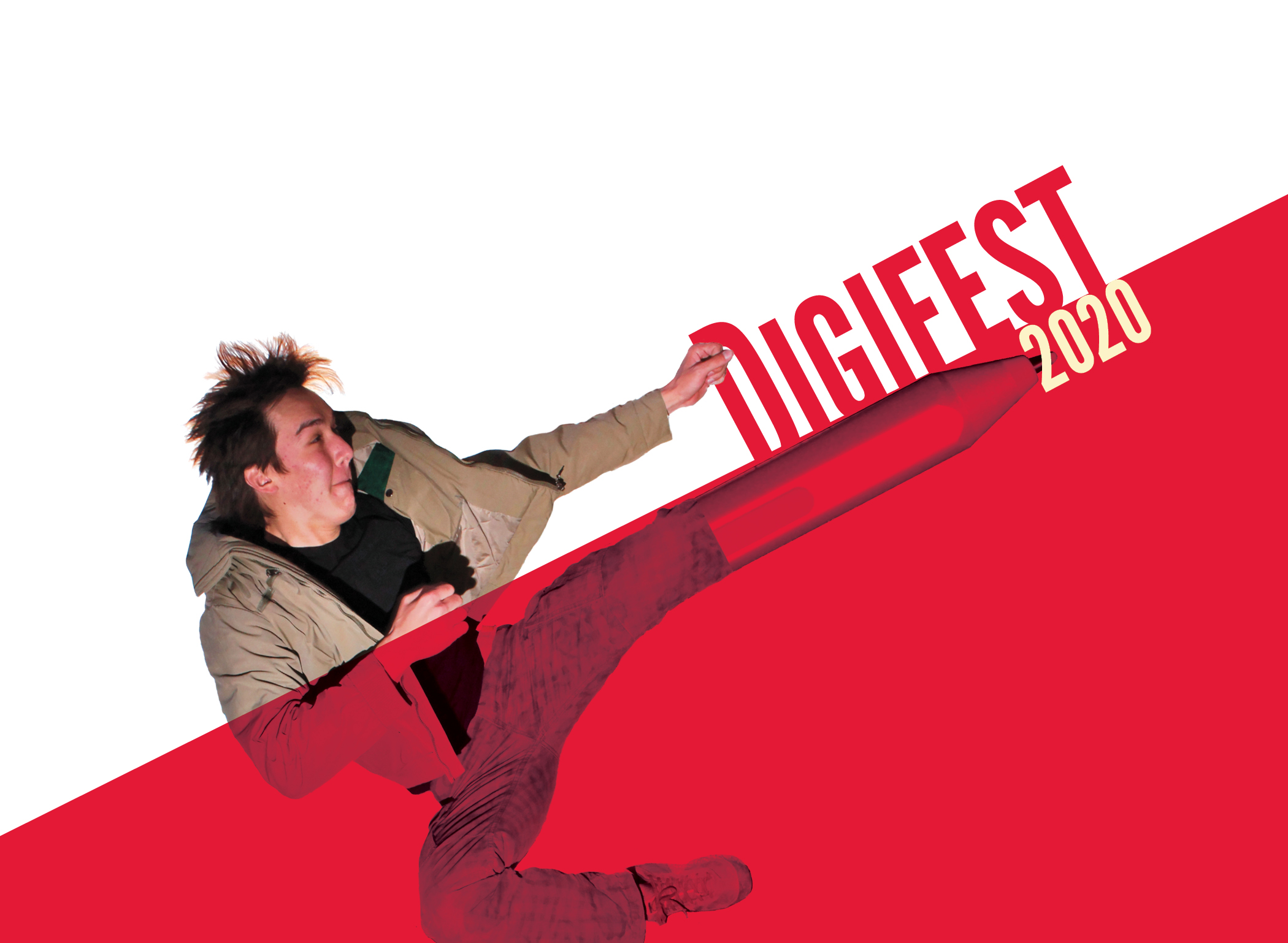
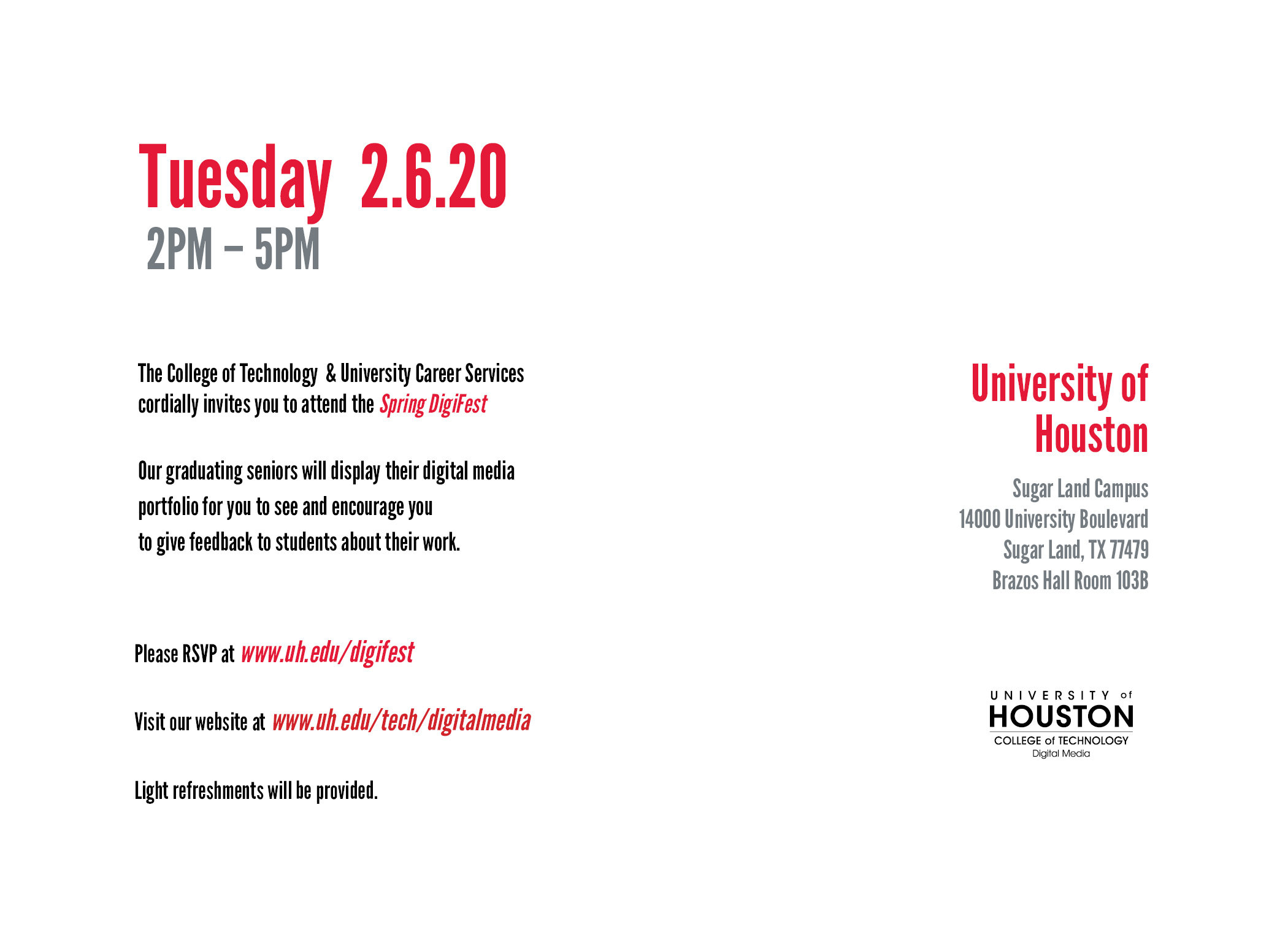
Creating a identity system for Digifest, the Digital Media senior showcase held at the University of Houston.
ID System
InDesign
Photoshop

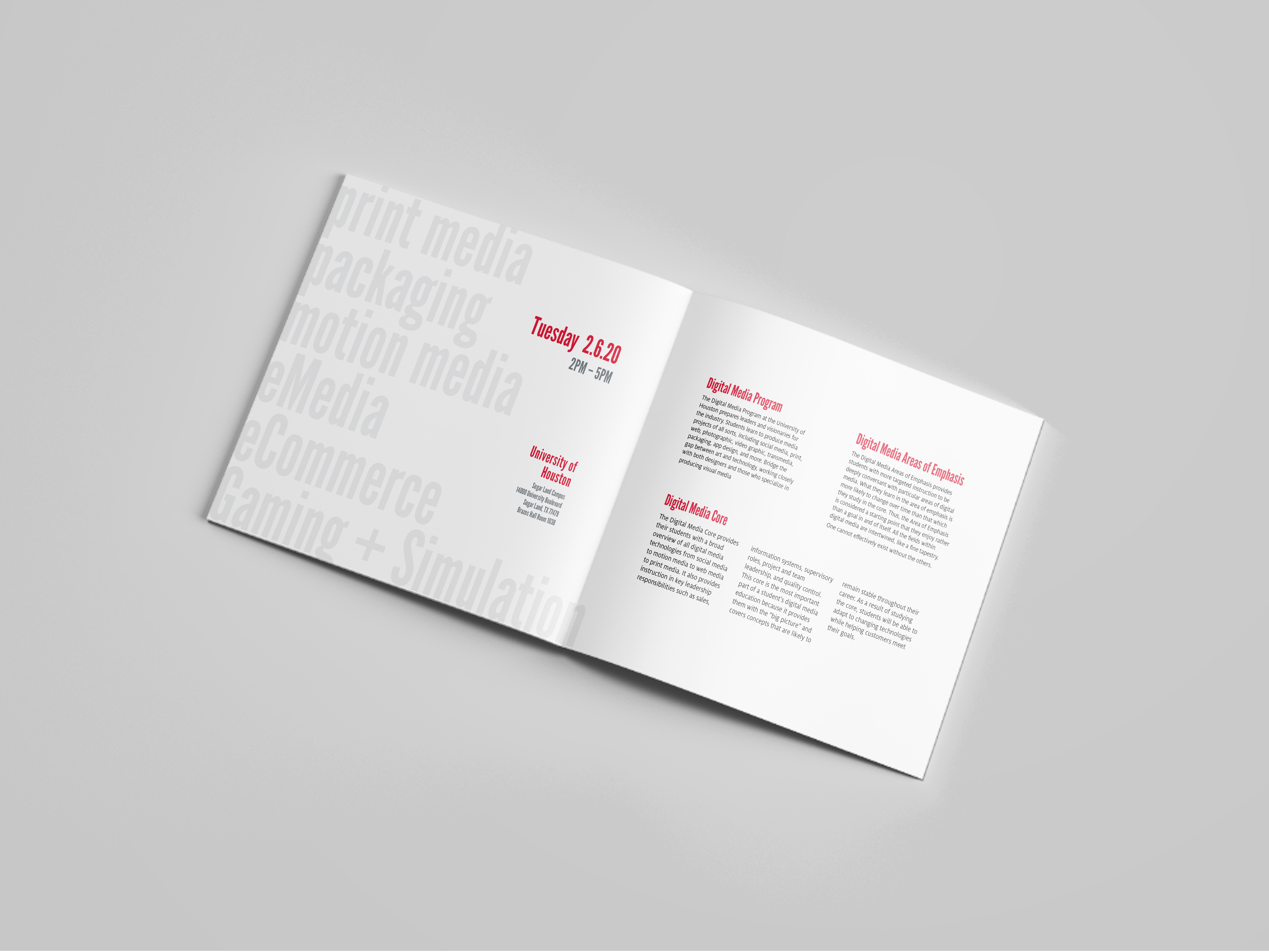
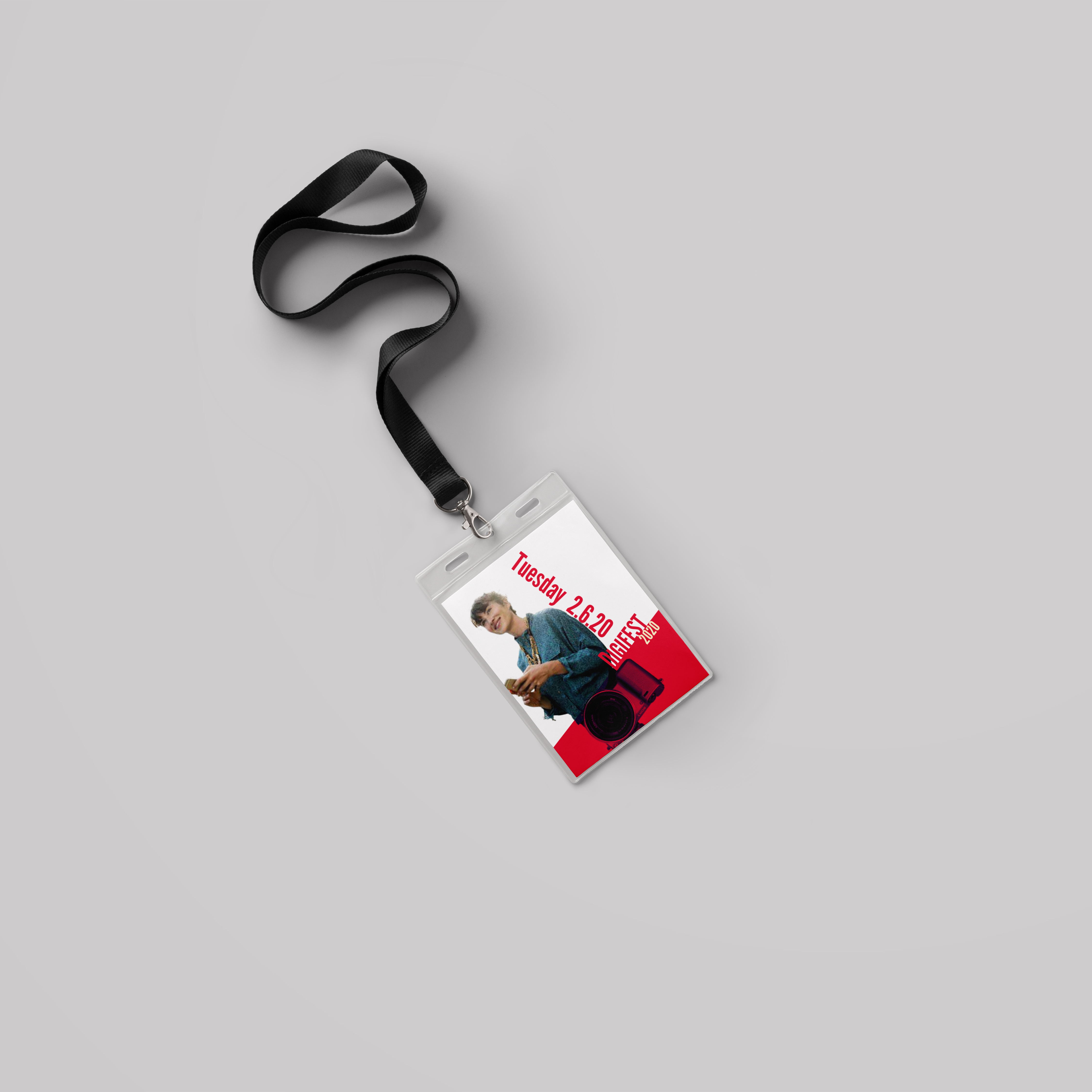
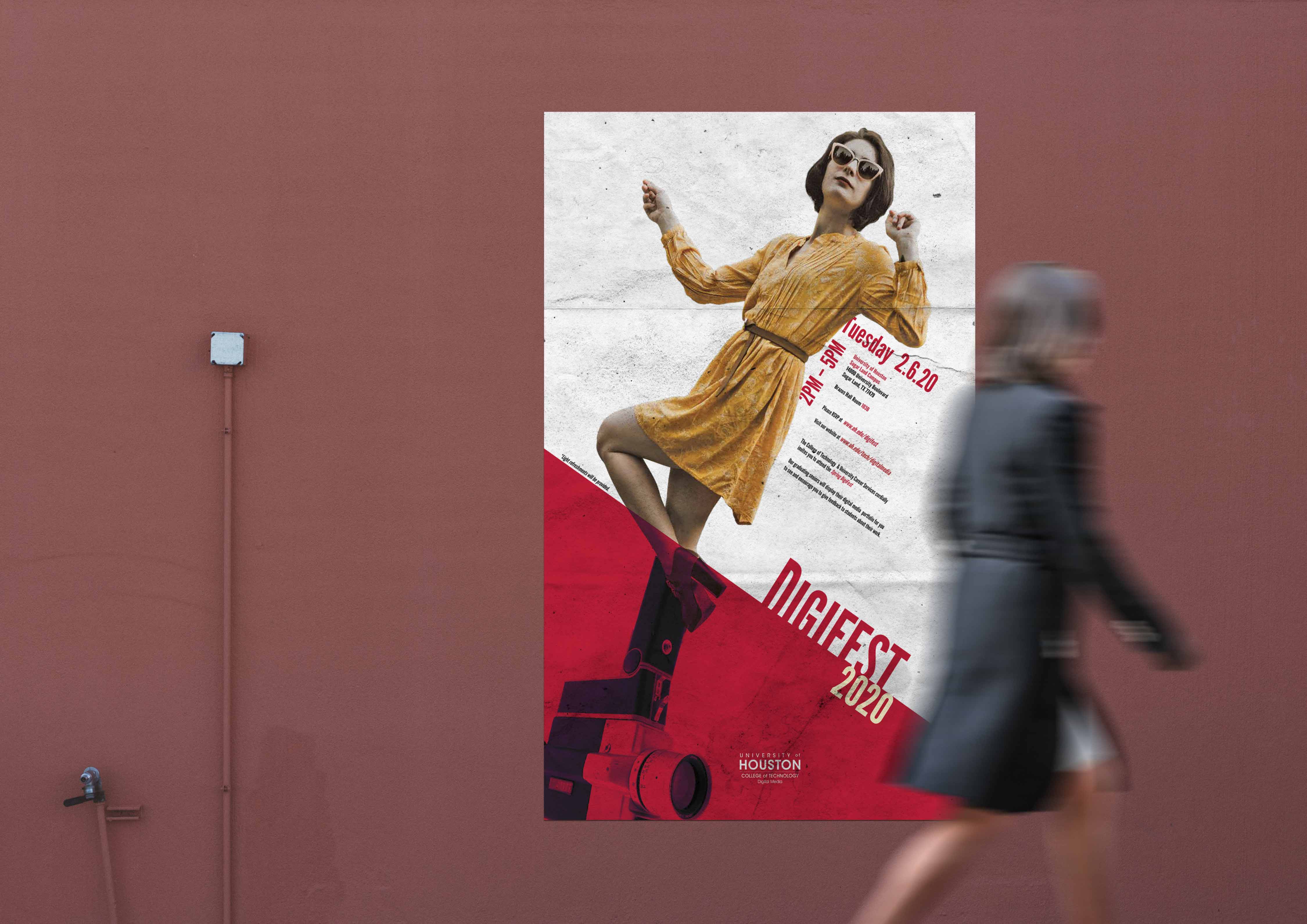
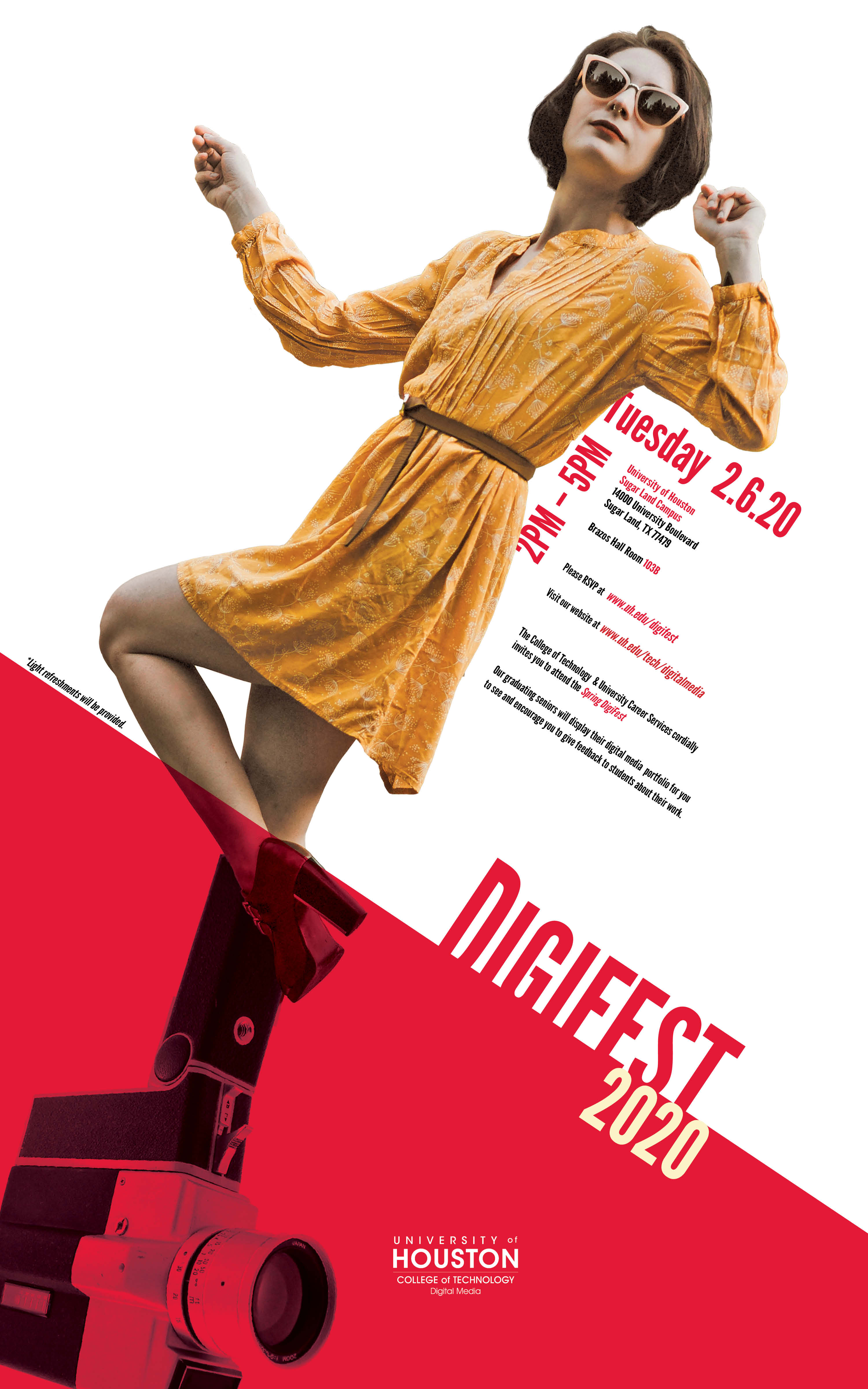
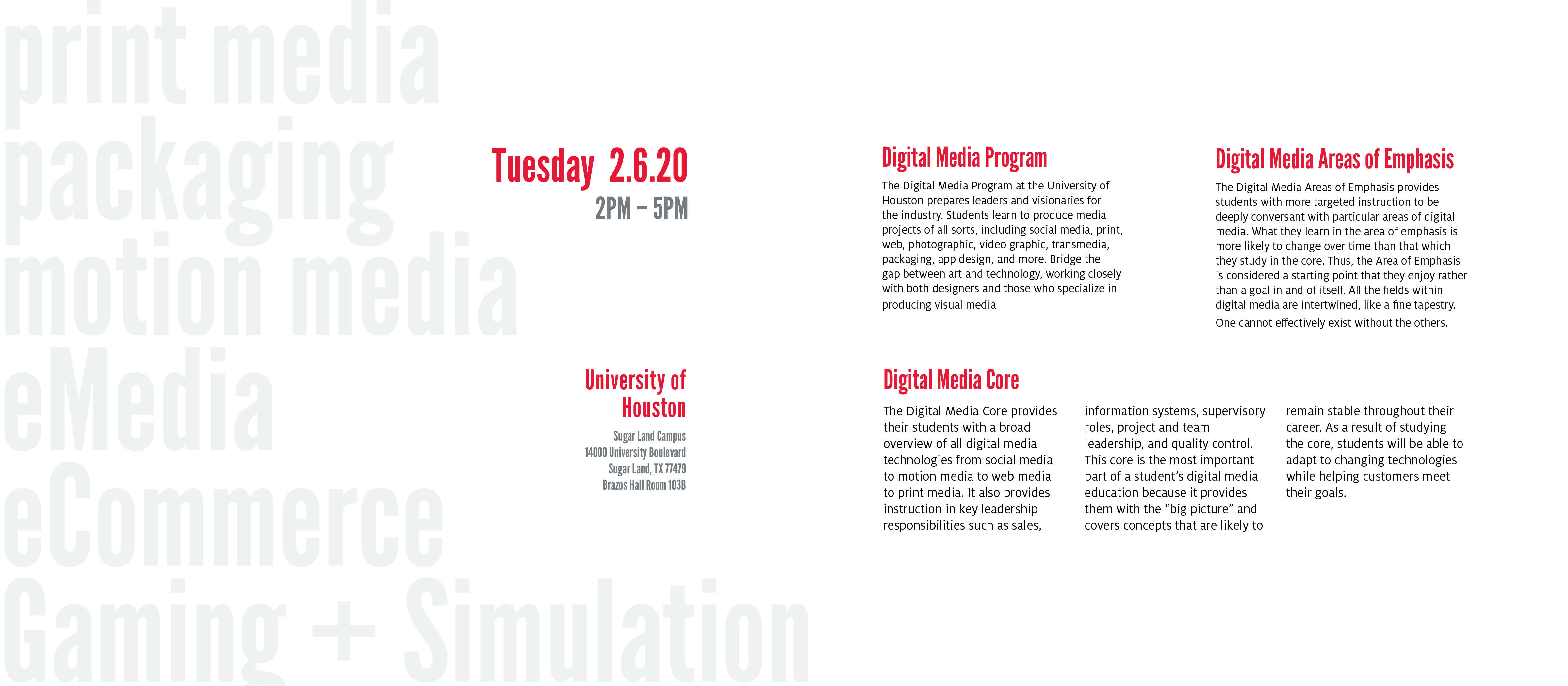
DIGIFEST is a biyearly event where seniors can showcase their portfolios to visiting employers at the University of Houston. Students display projects in fields that include eMedia, E-commerce, gaming and simulation, packaging, motion media, digital photography, graphic design, web, and print. Events such as these often require promotion materials that share parallel designs; separate design materials that share elements to bridge them together as a whole system. This project incorporates parallel structure and the UH branding style to design a poster, an announcement card, a brochure, and an access card for DIGIFEST 2020.
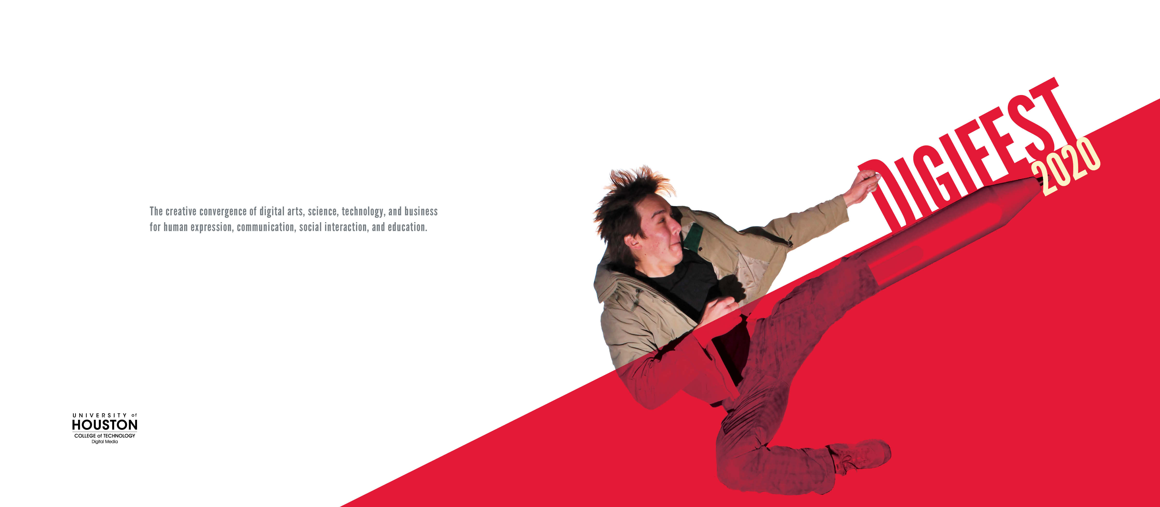
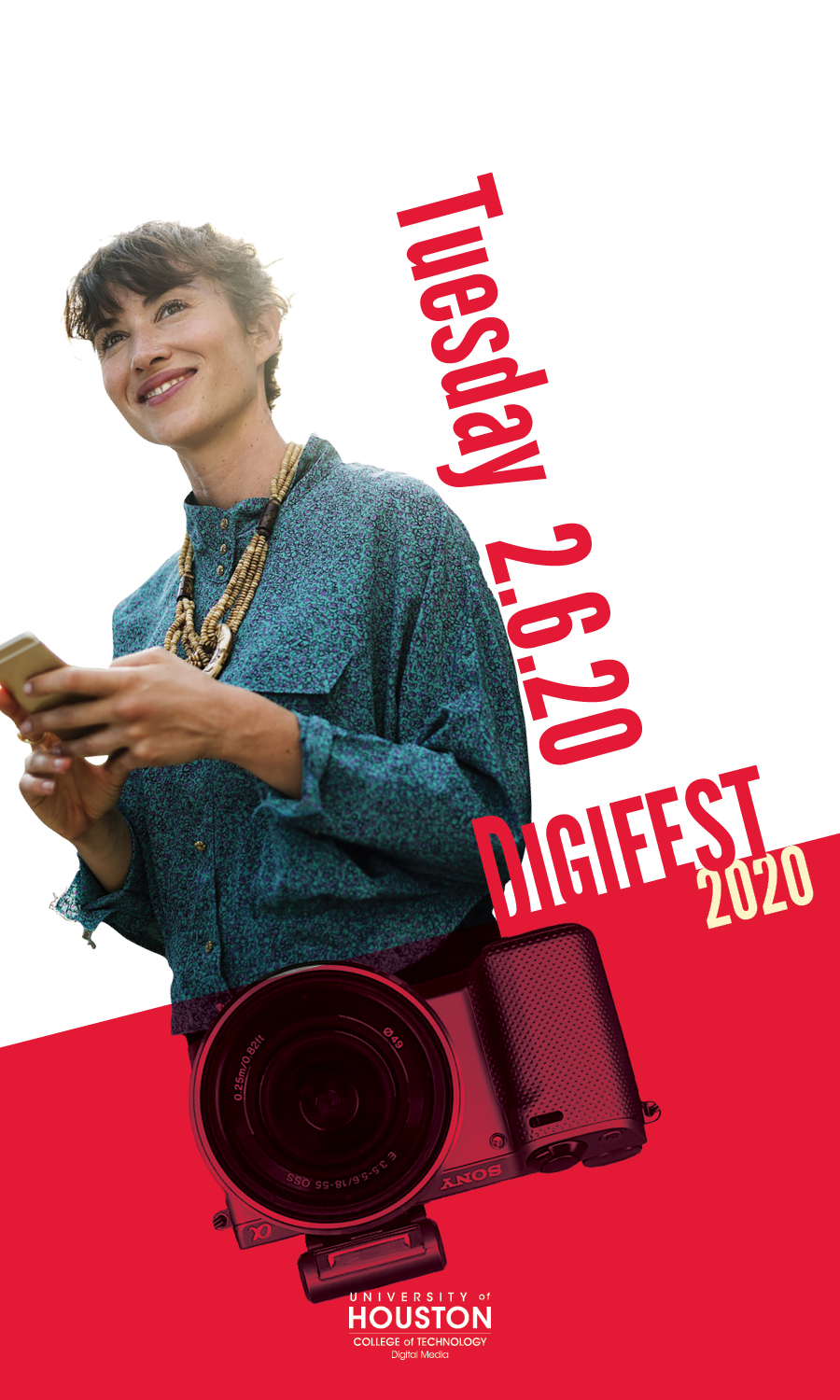
Digital media incorporates many tools to deliver a message or tell a story. Cameras, video cameras, drawing tablets, and computers are just some of the tools that are used by those in the digital media field. One of the things I found out when I joined the digital media field was that digital media revolves around people; people are needed to create media and needed to consume media. What I wanted to focus on was the person behind the tool used to tell the message.
Using humans as the core of my design, I chose pictures of people to be the focus of each design. I also added pictures of different tools used in digital media and put it together with the picture of people using juxtaposition. Adding the two together implies that the person on the design is a digital media artist. I then went on to create an element that bridges the different pieces together to create parallel designs. Using the UH branding style, I chose red as my primary color and applied a banner across all the pieces that stopped at the juxtaposition point where the picture of the tool meets the picture of the person emphasizing the connection.
02
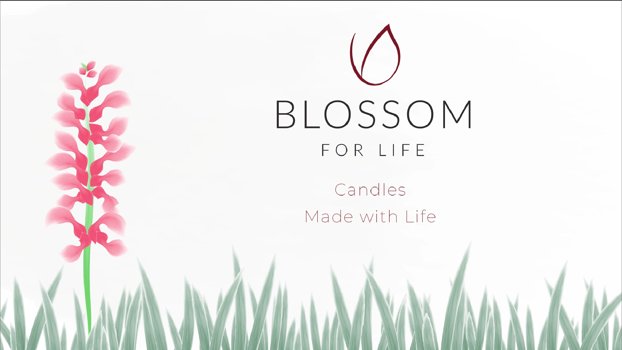
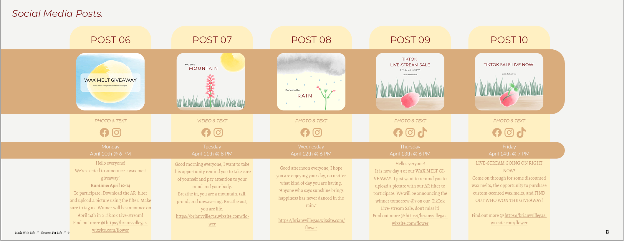
Transmedia marketing campaign to increase the Blossom for Life's exposure and audience livestream interaction from young men and women with families in Houston by May 2023 that will run accross multiple platforms such as Instagram, Facebook, TikTok, print media, and a website showcasing their products and stories.
Transmedia Marketing Campaign
Indesign
Lightroom
Photoshop
Illustrator
Animate
Aftereffects
Premiere Pro
Wix
Meta Spark Studio


03

Movie Poster created for my imaginary film - The Wanderer and the Ruins of the 7 Kings
Poster Design
Photoshop
Illustrator
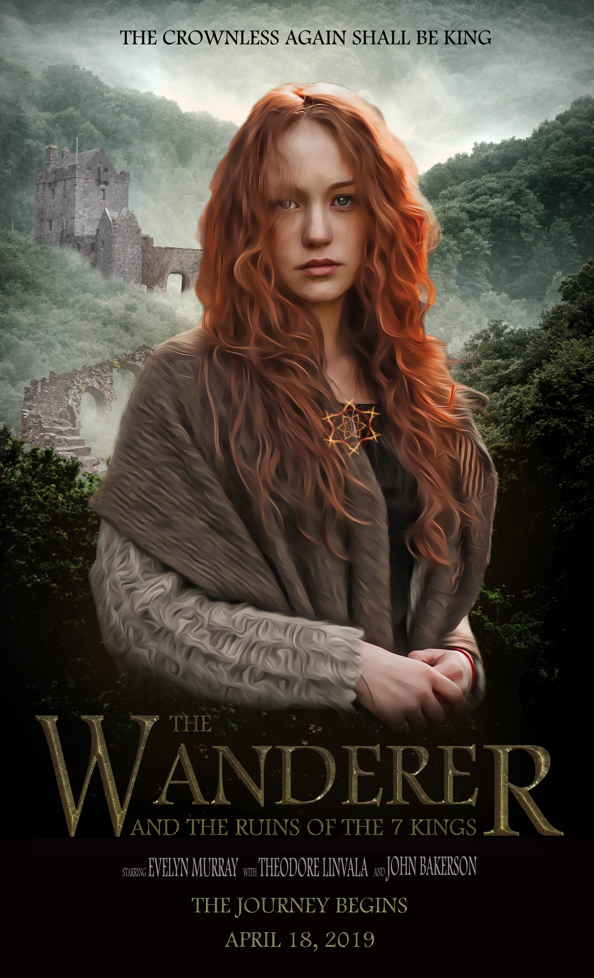
The goal of this project was to create a movie poster for a non-existent movie with a clear, target audience. The poster cover had to create an impact and the title had to be memorable, unique, and legible.
My poster targeted Fantasy Adventure fans between the ages of 15-35.
After researching the competition, I found that there were two movie franchises that were the amongst the biggest names in their respected genres:
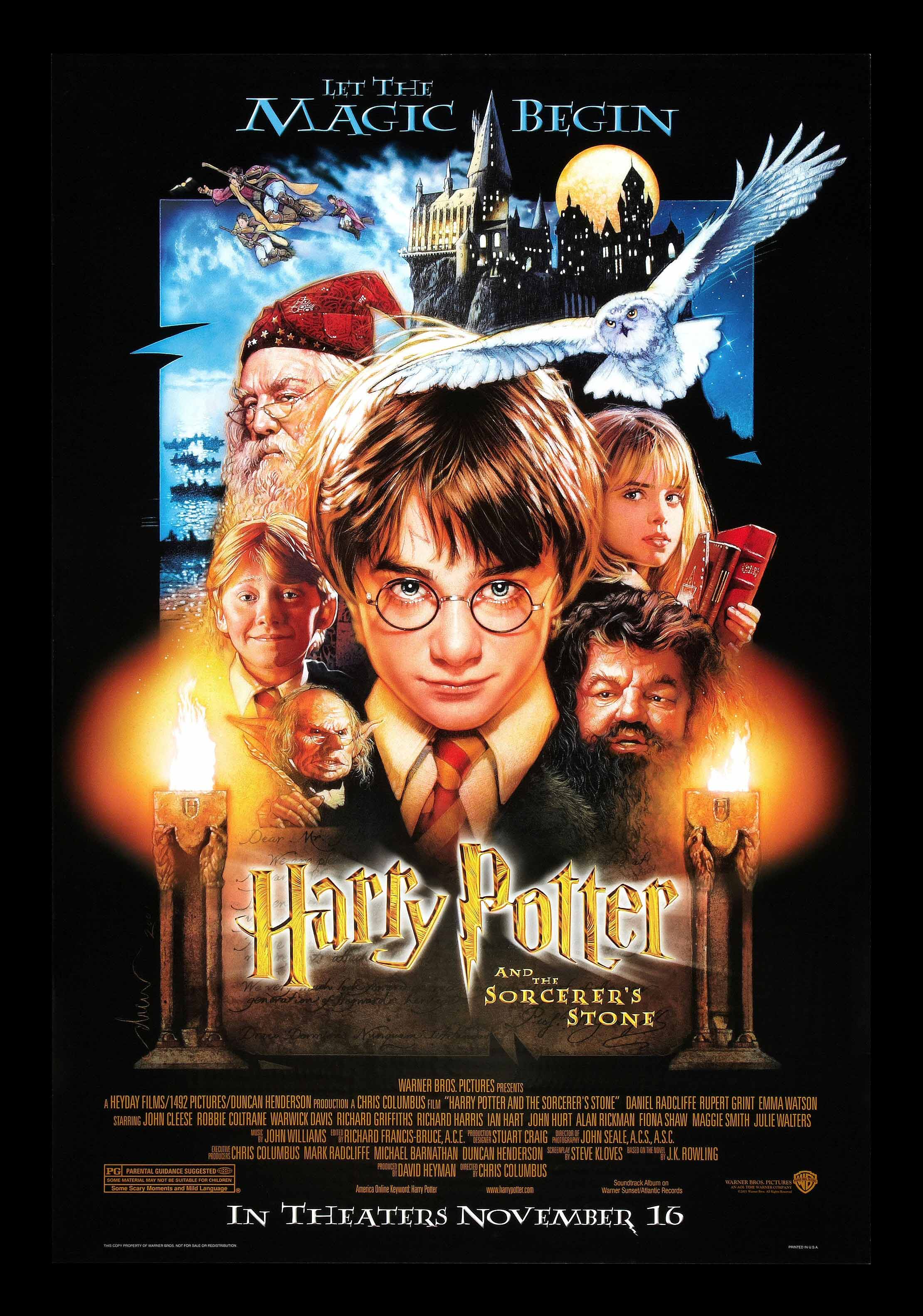
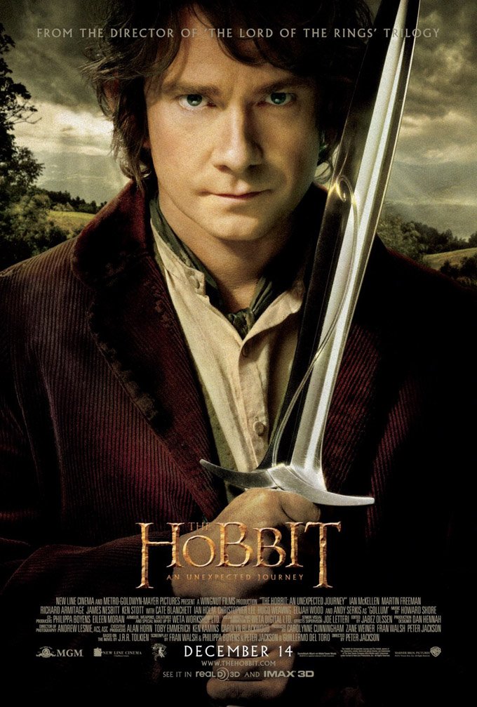
Harry Potter and The Hobbit
I specifically chose the posters for The Hobbit: an Unexpected Journey and Harry Potter and the Sorcerer’s Stone because those were the films in their series that served to begin their adventures.
Both movie posters focus the attention on their characters. The main character is right in the middle of the poster and staring into the viewer’s eyes. This simple aspect of the poster managed to knock out many key features that create a good movie poster according to Carpenter and Snitker. By having the main character take up a big portion of the space and having them defiantly stare right into the viewer’s eyes,
it serves as both an attention grabber and creates tension without showing an action scene.
The characters in the Harry Potter poster are drawings as opposed to actual pictures, this was the style for most fantasy and sci-fi movie posters before the 2000s.
The movie title is right under the main character so that the viewer’s attention would drift to it next. Another big aspect of fantasy movie, especially fantasy-adventure, is that they incorporate key landscapes and key objects into their posters. Harry Potter and the Sorcerer’s Stone shows the school in the background, and owl flying, a person flying on a broomstick, the 2 torches on each side of the main character, a character wearing a wizard hat, and a character holding books. The Hobbit movie poster does this more subtly, they just show the landscape in a small space in the background and make sure that the iconic sword that the character is holding is the next thing that the viewer focuses on.

My project incorporates those aspects while also making modifications to better fit my movie poster. The first thing I wanted was to have the character be the focus of the poster, I wanted it to be the attention grabber and the tension maker. Although The Hobbit movie poster succeeded in those points, the character was too big and covered up most of the space of the poster allowing very little room to show the rest of the world. The Harry Potter movie poster had a much smaller character to allow room for more characters and more landscapes and objects, unfortunately they cluttered the poster with too many of these objects that they made it hard for the viewer to understand what to focus on next, thus becoming too chaotic of a poster.
The character in my poster is a drawing that is smaller than the character in the movie poster for The Hobbit so that I may add more content but bigger than the one in Harry Potter so that I may reduce the risk of adding too many objects onto my poster. The size of the character allowed me to show more of the landscape as well as the ruins which would be assumed to be a key landmark to the movie and the story. By incorporating these aspects into my poster, the focus of the viewer would likely reveal the character first, then the movie title, then the ruins in the background, then the quote on top of the poster, and finally the misty landscape in the background that will all serve to set up the setting in the movie without revealing too much of the story.
04
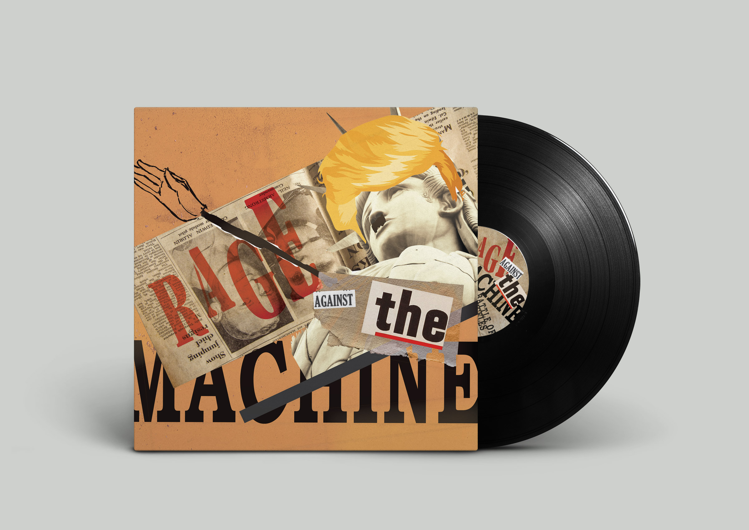
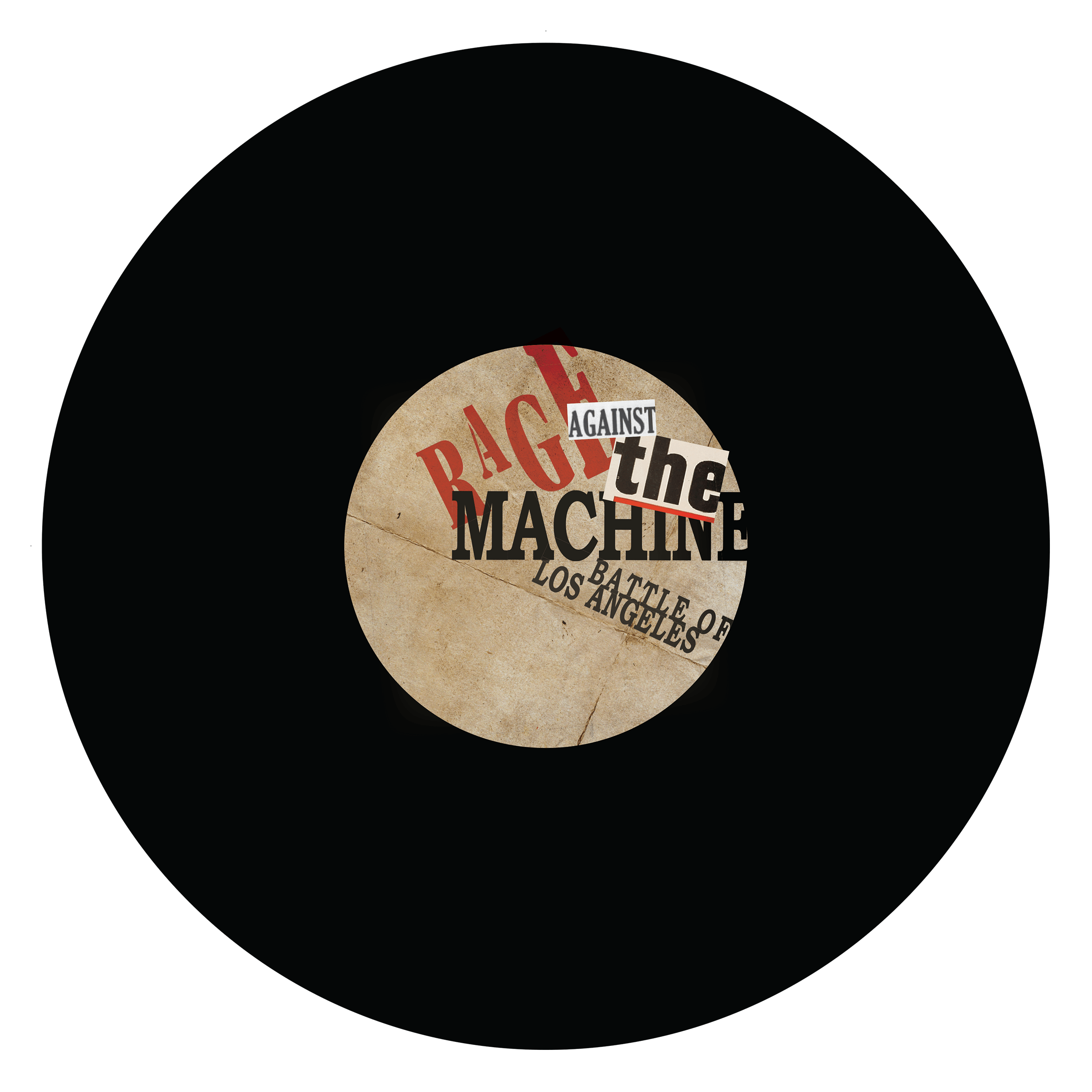
Rage Against The Machine - Battle for Los Angeles.
Album recreation inspired by a study of the Dada Art Movement.
Album Cover Design
InDesign
Photoshop


The 20th century was a time that nurtured rapid change and transformation in almost every aspect of human society. During this time, we saw the development of many art and design movements, of these movements I decided to learn more about one called Dada. Using the Dada art movement as inspiration, I was tasked with designing an album cover for the band called Rage Against the Machine.
The Dada movement took root in Europe and North America during the outbreak of World War I and is often thought to have started as a protest against the bourgeois nationalists and colonialist interest which they believed were the main cause of the war. Dada art exhibits traits that reject logic, reason, and a modern capitalistic society. Rage Against the Machine is a rock band formed in 1991 that is well known for their anti-authoritarian and revolutionary political views. Sharing the same ideology as Dadaists, Rage Against the Machine create songs that talk about greed, colonialism, and nationalism.
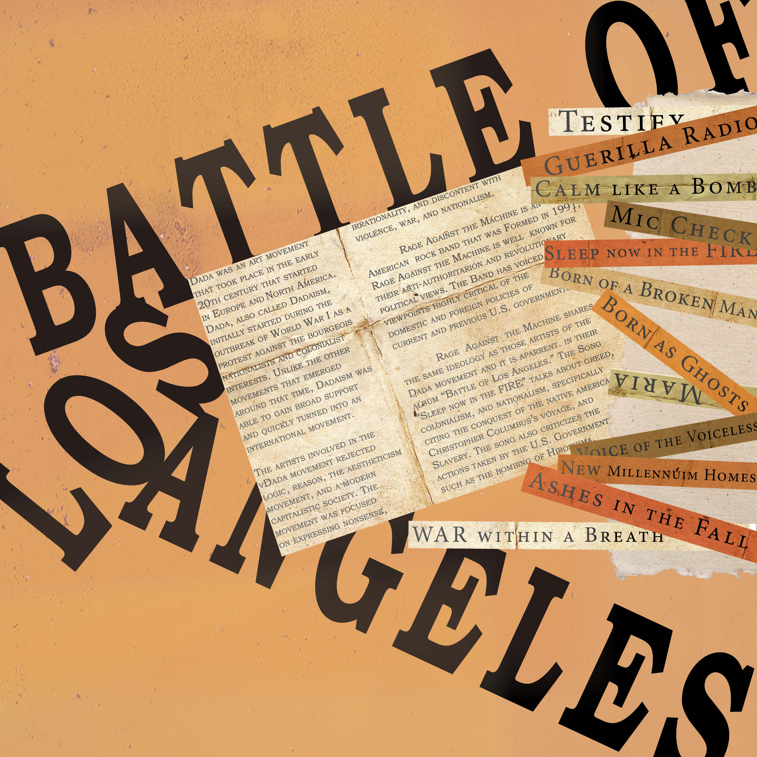
Focusing on the core beliefs of both the band and the art movement, was able to design an album cover that incorporates anti-authoritarian and anti-nationalistic views with nonsensical design. I decided to go with a collage for my overall look, as many dada artists did, to help display the rejection of logic and reason. Defacing the statue of liberty with a symbolic mustache and arm pose exhibits anti-nationalism and adding a famous hairstyle alludes to a specific authoritarian being responsible for the state that the statue of liberty is in.
05

Creating a personal brand identity for myself.
Brand Identity
Illustrator
Photoshop
InDesign


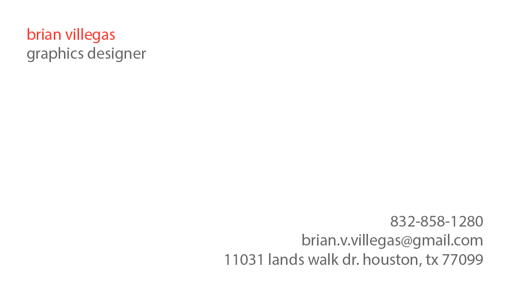
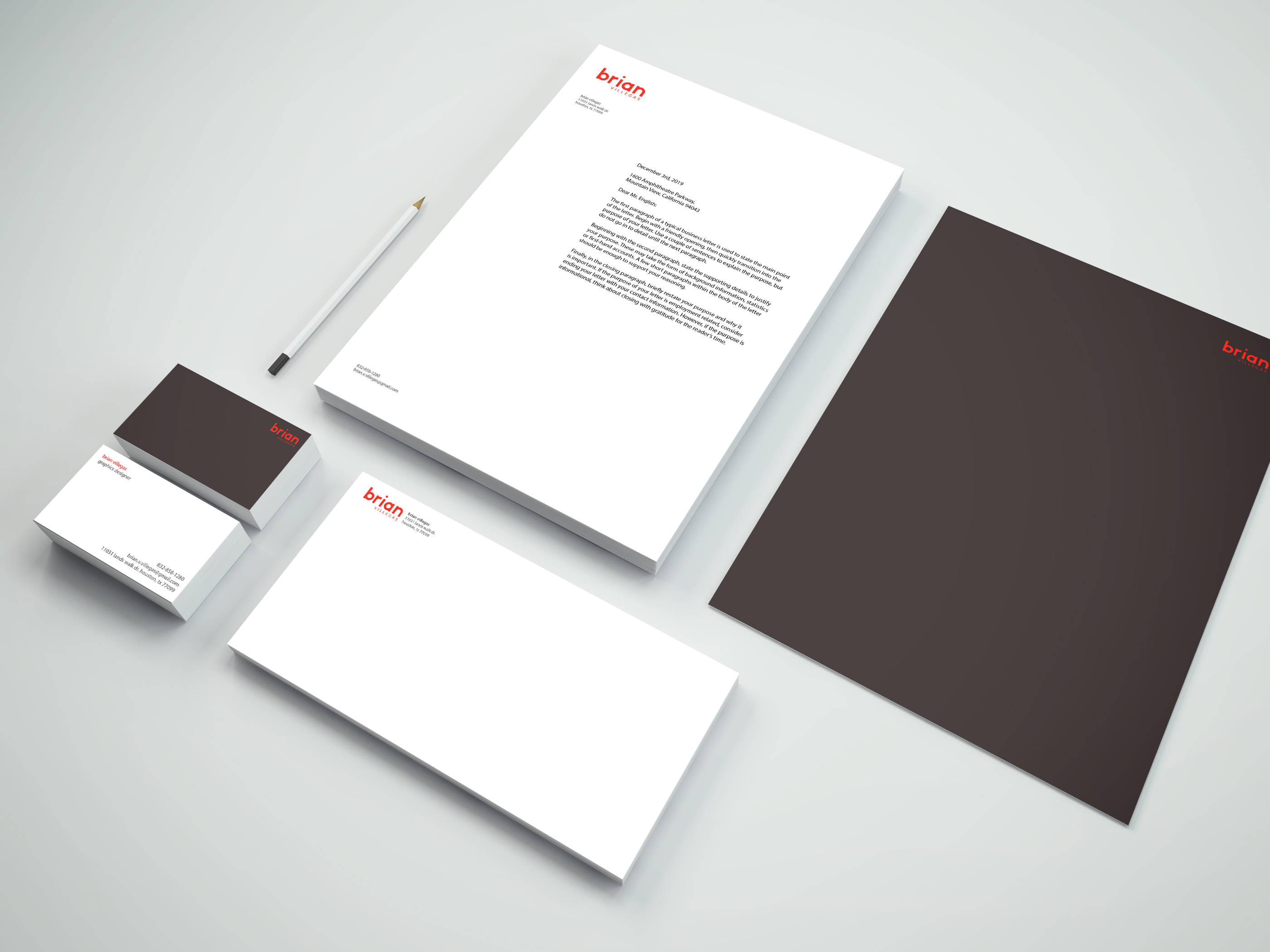
Personal Branding is the effort to communicate and present yourself and your value to the world. Brand identity is the visible elements of a brand, they include color, design, and logo, as well as other non-visual elements such as sound, smell, or taste. The purpose of this project was to create a personal brand using brand identity.
I started with creating the logo first, I tested out various type fonts the two that stood out to me the most were baskerville old face and myriad pro, I created different logos with those fonts and decided to stick with myriad pro as my typeface for my identity system, lowercase for most of my type except for the body copy. I then designed many different graphics to put next to my type and decided to go with none. Instead I created a font using the shape builder tool for my first name “brian.”

06
Creating a photo-realistic illustration using gradient mesh on Illustrator
Illustration
Illustrator
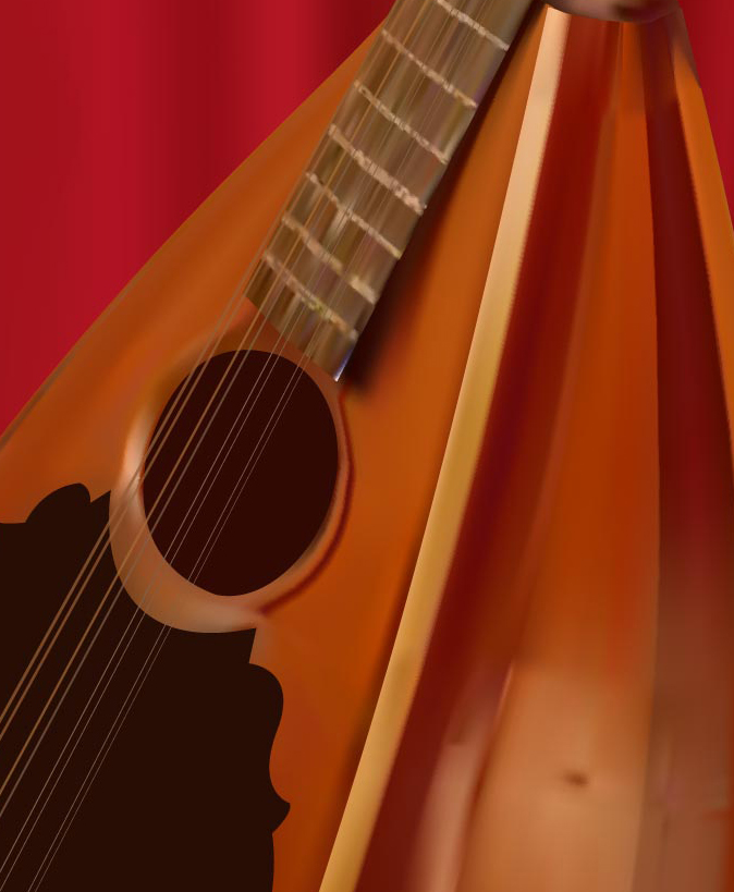


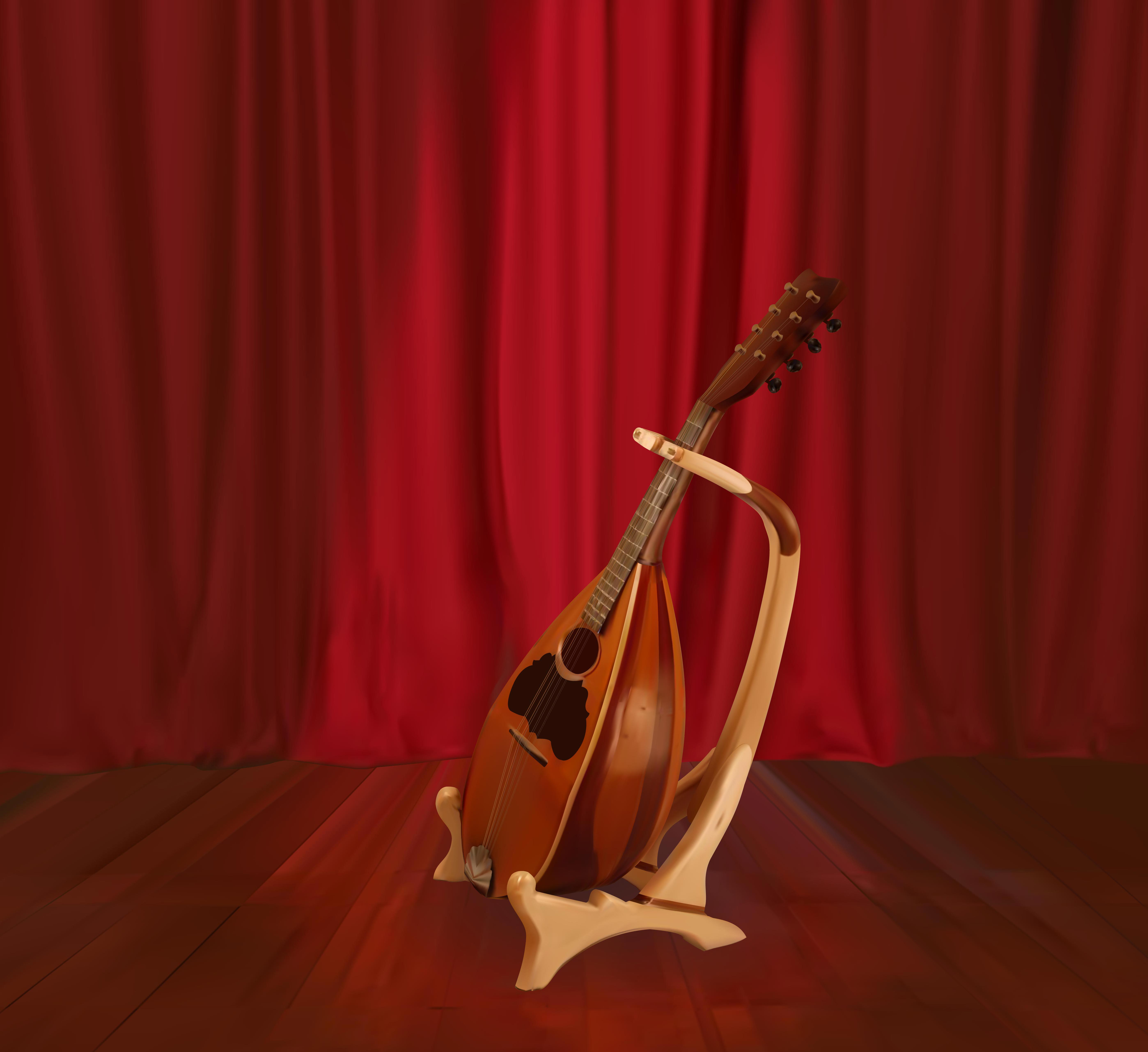
The goal of this project was to create a photo-realistic object using gradient mesh on Adobe Illustrator. When it came to creating this lute the gradient mesh tool struggled to incorporate and transition between the different shapes that made up this object.

I learned that the best way to go about this was to have multiple layers. I created separate gradient meshes on different layers for each shape that made up the lute and the lute stand. This allowed me to create gradient mesh objects of different parts of the lute that did not interfere with each other whenever I added more detail to specific layers.
Not only did this allow me to add more detail to specific areas, but having objects on different layers gave the lute more depth than I could not have achieved as easily if I had made the object on one layer instead.